
Brand Owner: FanFish Photography Studio
Design & Projectization by ZL:D
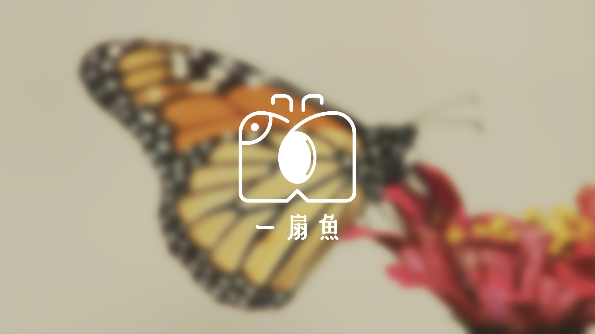
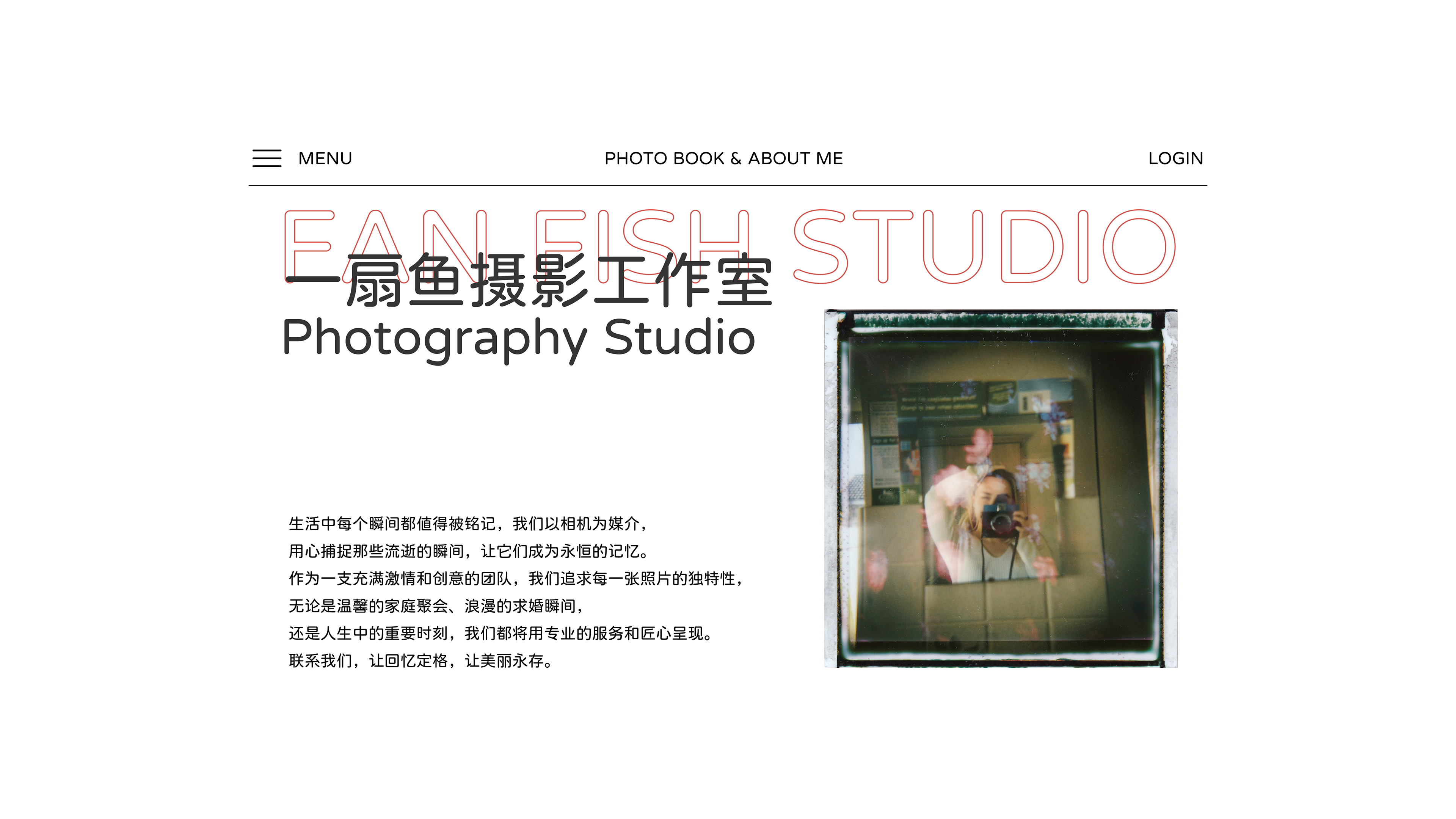
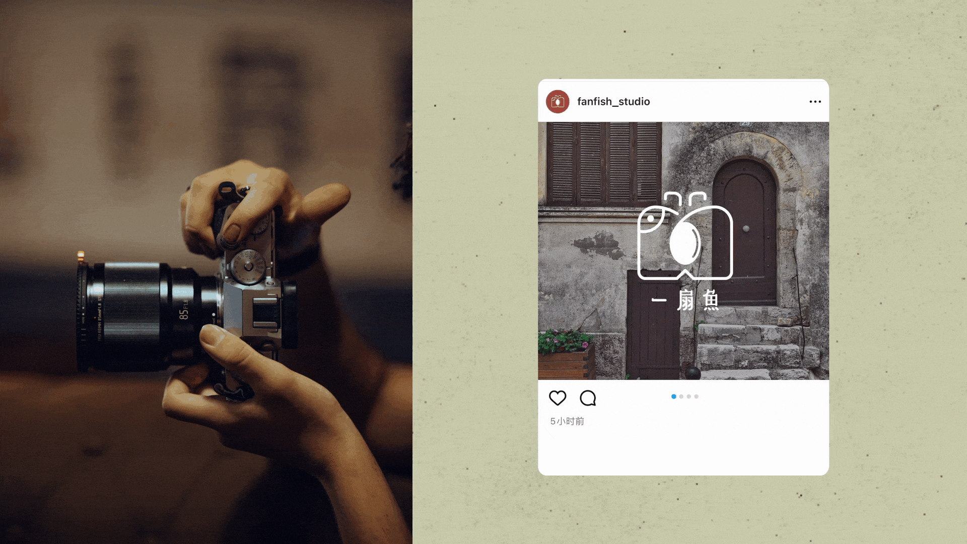
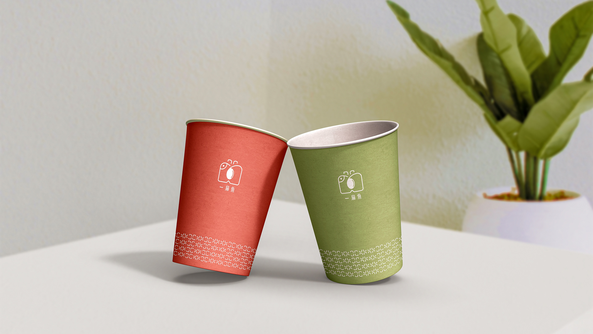
一扇鱼摄影工作室
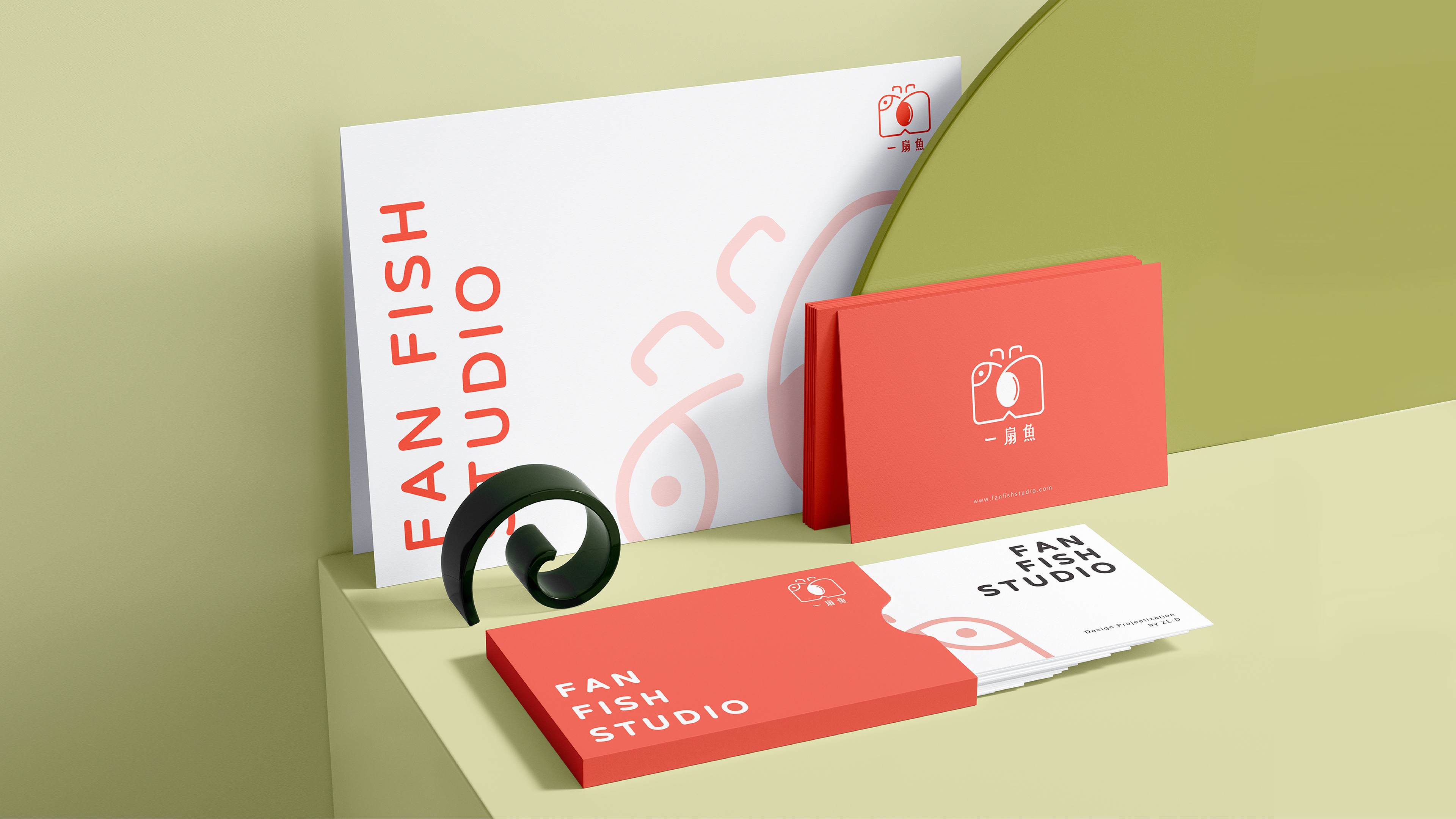
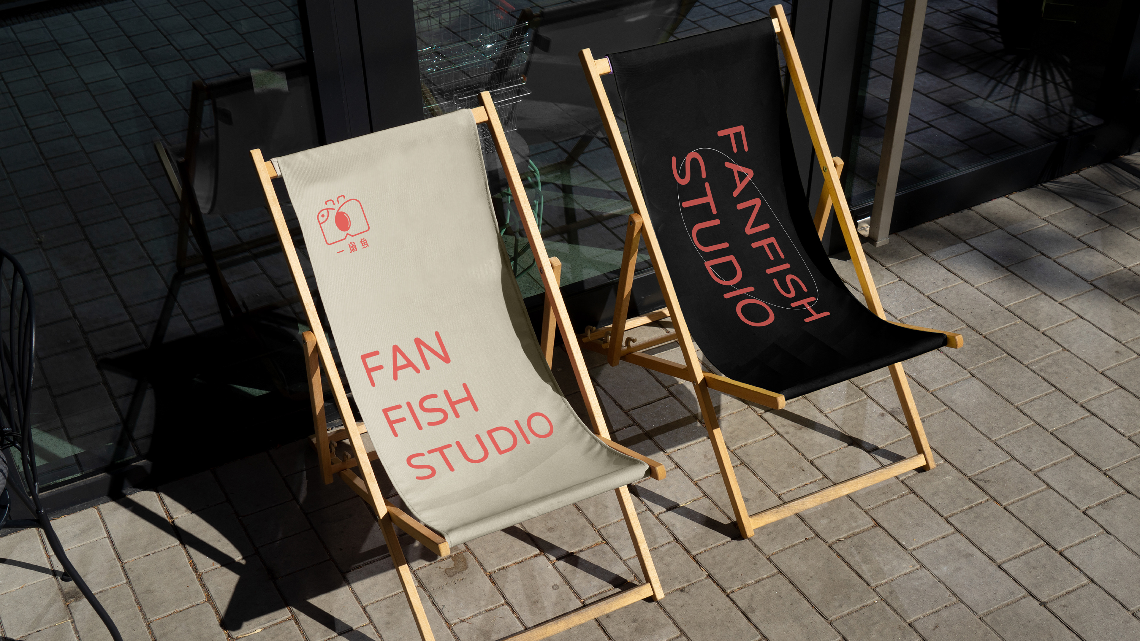
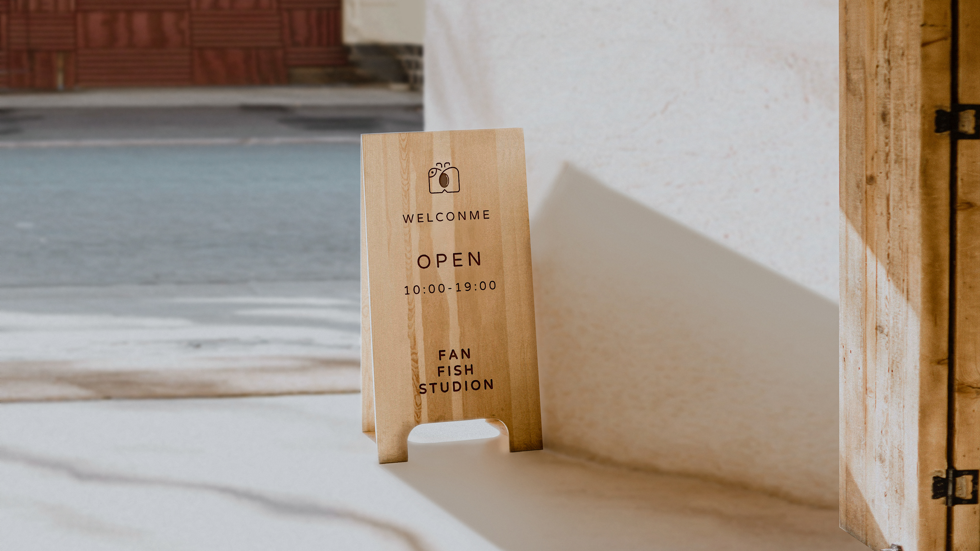
FanFish Photography Studio
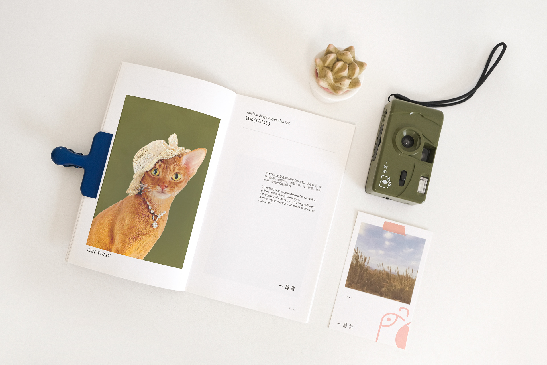
CLIENT: 一扇鱼专注捕捉年轻女性的珍贵瞬间,创造永恒回忆。作为一支富有激情和创意的团队, 他们通过精湛的摄影技术和专业的服务,从日常笑容到重要时刻,以相机为媒介记录生活的点滴瞬间。/ Fan Fish focuses on capturing precious moments of young women and creating eternal memories. As a passionate and creative team, they use their cameras as a medium to record every moment of life, from daily smiles to important moments, through superb photography skills and professional services.
CHALLENGE: 在遍布金华市的文艺摄影工作室中,主理人渴望通过一个充满文艺氛围、令人联想到故事情节的女性导向品牌名称,来与其他摄影工作室明显区分。她希望她的品牌能够引发女性客户群的认同感,并在看到品牌标识时激发好奇心和创想力。为了应对这些挑战,我们将协助她寻找一个独具故事性和独特性的品牌名称,并建立其独特的品牌形象。/ In the midst of numerous art photography studios in Jinhua City, the owner aims to set her brand apart by choosing a female-oriented brand name that exudes artistic flair and evokes a sense of storytelling. She hopes her brand will resonate with her female clientele and spark curiosity and imagination when they see the brand logo. To tackle these challenges, we will assist her in finding a unique and narrative-rich brand name and establishing its distinctive brand identity.
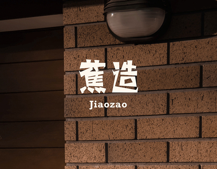
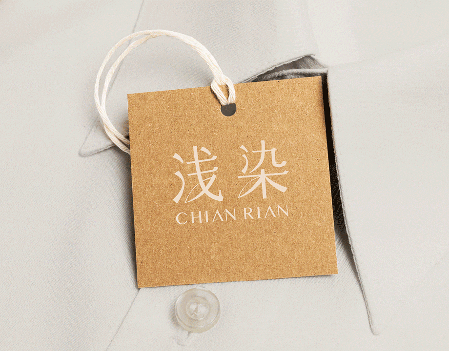
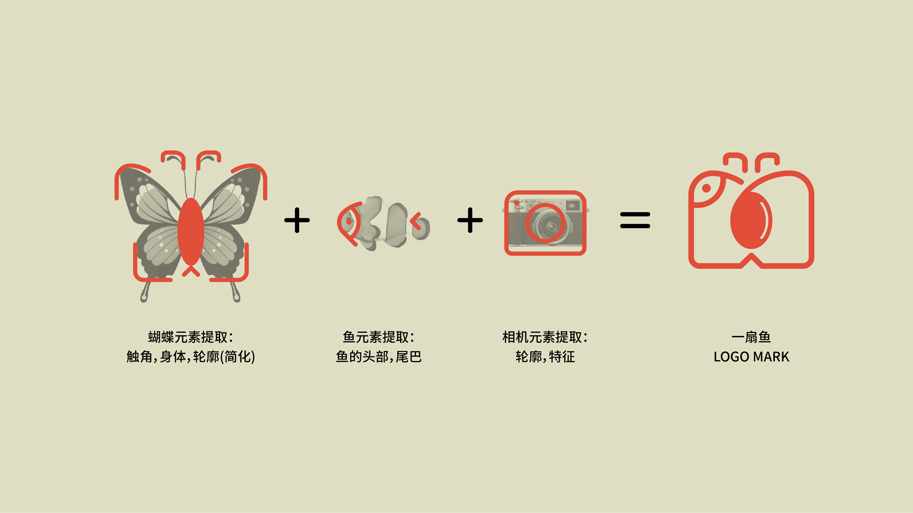
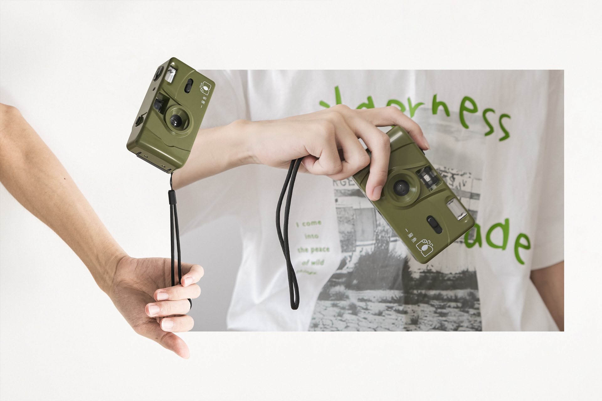
SOLUTION: 主理人的姓氏,"单"的发音与"扇"相似,这启发了我们将蝴蝶与鱼融为一体的联想。这个联想传达出一种优雅翩翩起舞的感觉。因此,我们将鱼的计量单位从传统的单位中改为了"扇",以此独特的计量单位来赋予这只即将飞翔的鱼一个特殊的名字——"一扇鱼"。这个名字既包含了鱼在水下自由自在的特质,也蕴含了冲破水面的勇气。在品牌标志的设计中,我们巧妙地融入了鱼和蝴蝶的特点,呈现出一个独具特色的三元符号。"一扇鱼"是一个渴望突破常规的品牌,因此我们以明朝体为基础设计了品牌文字,同时添加了圆润的边角,突破了传统明朝体的规矩,使其独具一格。"一扇鱼"整体给人以文艺、大胆和独特的印象,不论是图形还是文字都能激发人们的想象力。/ The owner's surname, "单" (Shàn), sounds similar to "扇" (Shàn *fan), which led us to envision a fish intertwined with a butterfly, evoking a sense of graceful dancing. Hence, we changed the unit of measurement for A “扇”(shàn *fan) of fish, using this unique measurement to name the fish that's about to take flight, giving birth to the distinctive name "一扇鱼" (FanFish). "一扇鱼" embodies both the freedom of a fish underwater and the courage to break through the water's surface. In shaping the logo, we artfully integrated the characteristics of a fish and a butterfly into it, resulting in a logo with three unique elements. "一扇鱼" is a brand aiming to break the mold, so we based the brand typography on Ming-style script, with rounded edges to differentiate it from traditional Ming script. Overall, "一扇鱼" exudes an artistic, bold, and unique vibe, inspiring imagination both through its visuals and text.
© All rights reserved(版權归品牌方所有,抄襲、盗用必究 ◡̈ ).
Legal support(法務支持): 上海日盈律師事務所

— Design Power —
Brand Owner(品牌方): 一扇鱼(FanFish Studio) | Publishing Region(發行地): ZJ, China
Project Director(項目統籌): Leven | LOGO:Leven | Publish Director(发布监制): Leven
Graphic Design(平面设计): Tianshu, Leven | Photography & Visualization(效果图): Tianshu, Leven, ChillM
Copywriter(文案): Tianshu, ChatGP
Project Director(項目統籌): Leven | LOGO:Leven | Publish Director(发布监制): Leven
Graphic Design(平面设计): Tianshu, Leven | Photography & Visualization(效果图): Tianshu, Leven, ChillM
Copywriter(文案): Tianshu, ChatGP


©️ 一扇鱼(FanFish) | Design by ZL:D©️ | Jul. 2022
All rights reserved(版權所有,抄襲、盜用必究 ◡̈).
Legal support(法務支持): 上海日盈律師事務所 (馮律師: 13524537661@126.com)
ZL:D©️ Website: www.ZLeven.cc | Contact: info@ZLeven.cc
Thanks for watch ◡̈